Notes
How this site pairs Stellar's tokens, and why.
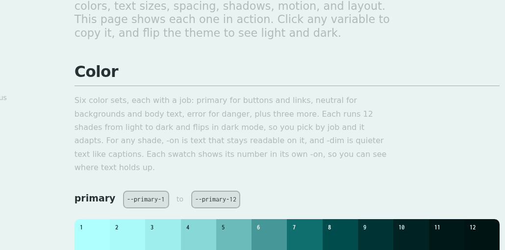
Pairing tokens
Each shade comes with an -on for text that reads on it and a -dim for quieter text, both tuned to that exact shade. For an accent on a different surface, like a link on the page background, pick a shade from another ramp with enough contrast.
Built on a neutral-1 surface
The three pairs this site runs on, over the neutral-1 background. Contrast is measured live, so flip the theme and it updates.
Primary text
Secondary text
Link / accent
Making -dim readable: dimTargetLc 30 -> 65
-dim is the secondary text here: ledes, notes, captions. At the default 30 it is decorative, 1.7:1 in light mode, below the 4.5:1 body text needs. 65 is the lowest that makes light readable: 4.4:1 in light, 9.9:1 in dark, still softer than -on.
| dimTargetLc | light | dark | |
|---|---|---|---|
| 30 (before) | 1.7 | 4.0 | decorative |
| 50 | 2.8 | 7.0 | light still fails |
| 60 | 3.8 | 8.9 | |
| 65 (after) | 4.4 | 9.9 | readable, still muted |
| 70 | 5.2 | 11.0 | dark nears -on |
WCAG contrast of --neutral-1-dim on --neutral-1, light / dark.